A contextdriven care registration system
Because... #makecontextgreatagain
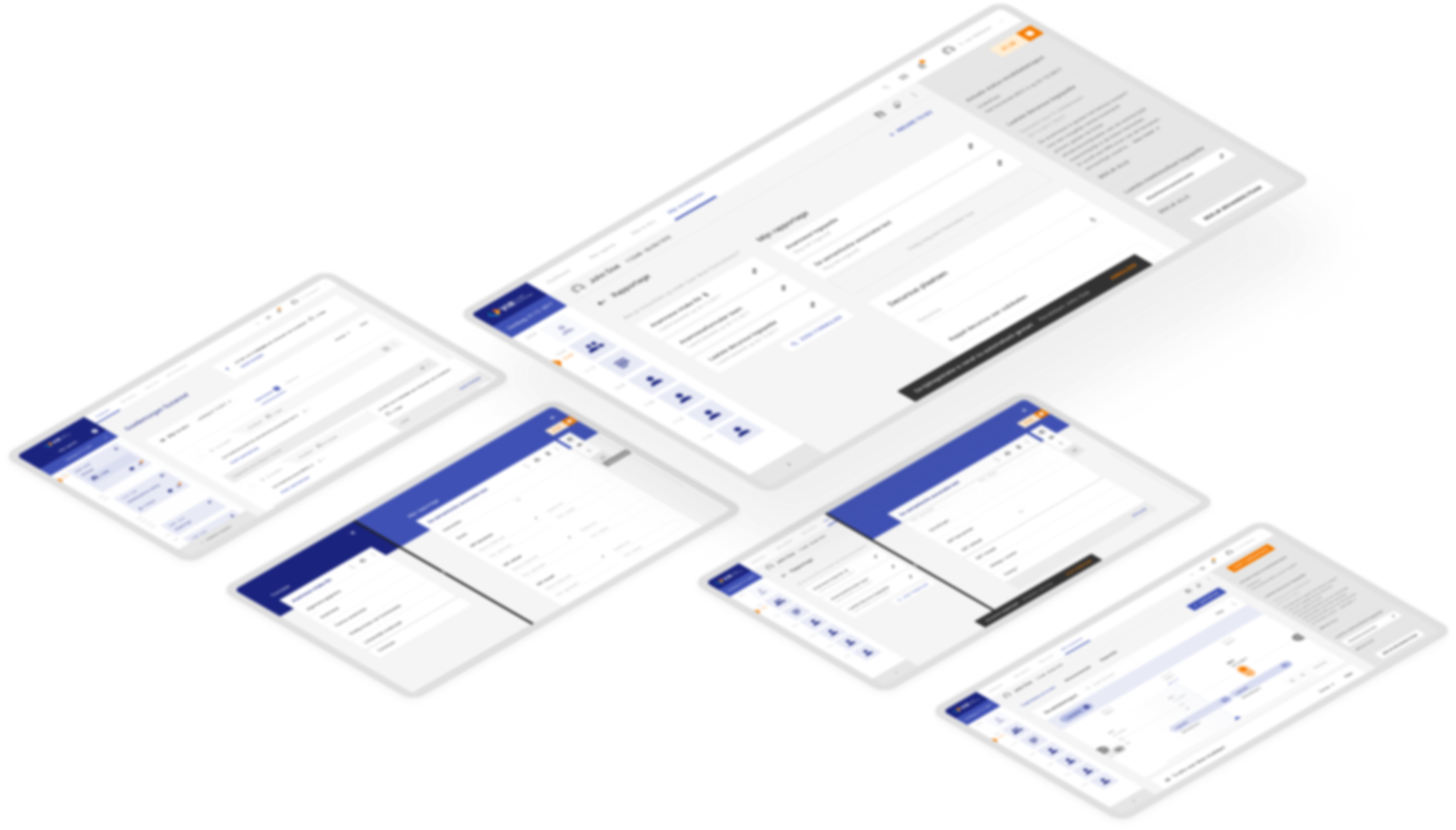
VIR e-Care Solutions is a software organization who develops software for rehabilitation care, such as an electronical health record (EHR). Due to user research they had discovered their products were not user friendly and therefore the need for an innovative solution arose. Together we formulated the following research question which was the start of my twenty weeks graduation project:
How can rehabilitation doctors and practitioners be supported with the aid of a context-driven Embedded Media Object or a (web) application before, during and/or after the treatment of a patient?

Process
-
First iteration
Because the healthcare sector is a huge thing we focused on three most outstanding use cases to get a realistic scope. Internal research, interviews and following typical days of the target group while mapping their activities and interactions learned me that doctors and practitioners are very – like, very, very – busy. They have to click massively in an EHR (no matter what system it is, so this also counts for the competitor). They lack overview of as well as the progress as the care process. This together costs even more time and make them… you can guess it: very, very busy.
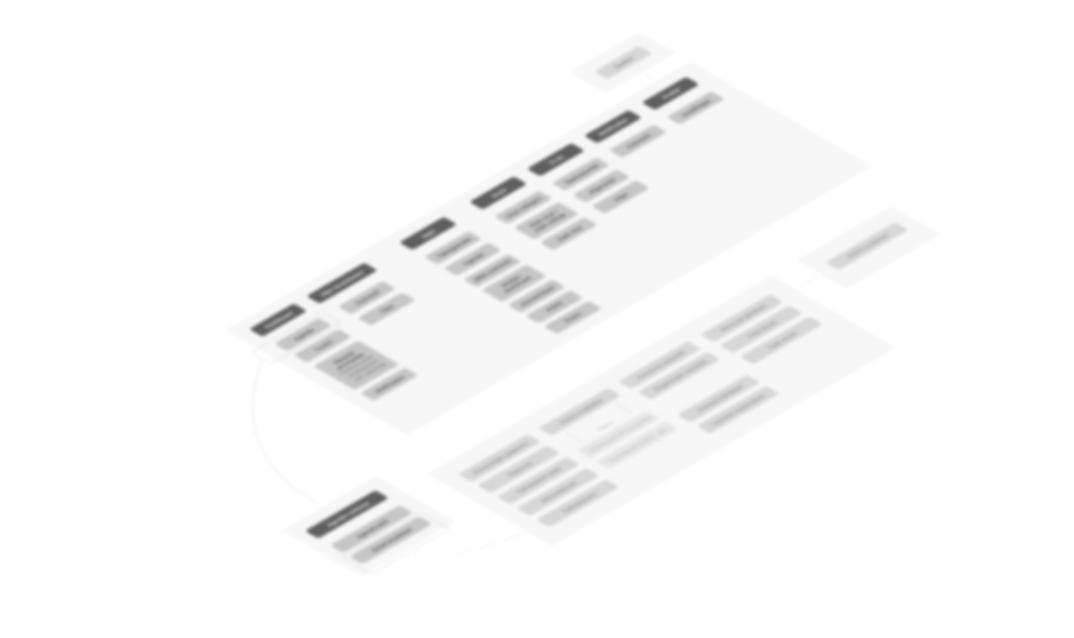
Mapping out task flows with contextual modals, ‘how might we’-questions, pesona’s with emotional journeys and testing a card sorting based on the use cases led to the concept of giving doctors and practitioners more insights in their workload that day.
An example persona I made: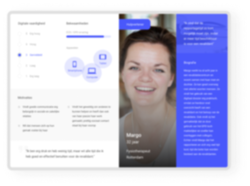
Current EHR’s are mainly focused on the patients and its registrations, but not on the actual work tasks for the healthcare providers
-
This first concept was tested with four participants based on a storyboard and concept visual. The thing was that all of my surrounders told me it would be impossible to test things with the target group, because… again you can guess it: they were too busy.
-
Nothing turned out to be less true
-
During this whole project I talked one-on-one with around thirty doctors and practitioners specialized in rehabilitation care from around everywhere in The Netherlands.
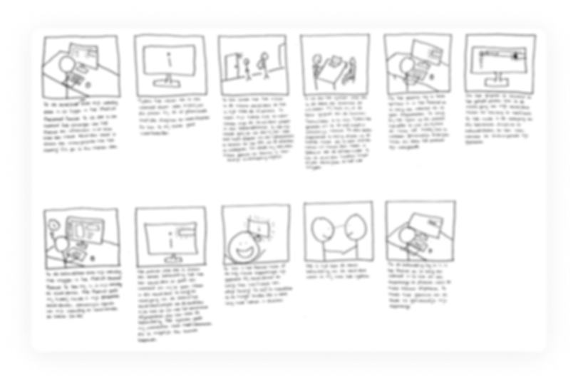
The storyboard I made:
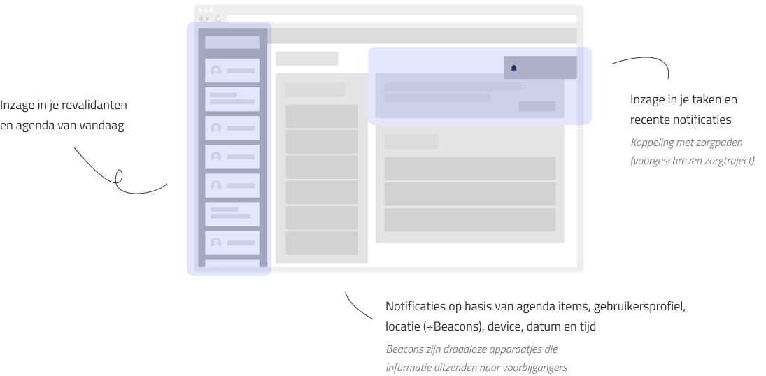
The concept visual I designed:
“If you can give me an overview of my appointments and my tasks that day and tell me what I should or could do, I would be so helped”
-
second iteration
The test results made me excited to dig in the concept even more. At the same time this became my weakness on this project, even though it worked out. At the end of the project I knew this wasn’t the right move. I had never showed them a possible second solution, which could maybe be even better. The good thing about it is that I’ve learned to not make this same flaw in the future, yay!
So… I continued sketching, finetuned my card sorting based on the concept (and therefore finetuned requirements as well as the information architecture) and tested it again.
-
third iteration
It learned me I was on the right track so I started designing a low-fidelity prototype in Sketch and InVision. Again I executed a test, this time a specific usability test with six participants.
Sneek peek of the low fidelity prototype I designed: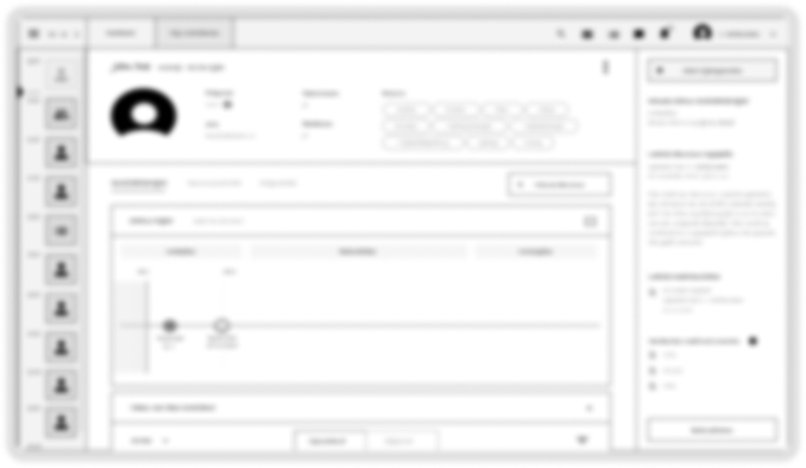
It turned out that transcending insight into your tasks and agenda is very valuable as a starting point. The target group was very enthusiastic about the visual timeline at the EHR of a patient, but did not understand it was interactive (possibly due to low fidelity, but also a new pattern, thus learning curve). With the test results I found out the scope got too big, so after many stakeholder sessions I wrote every test result down and got back on the right track to start my last iteration.
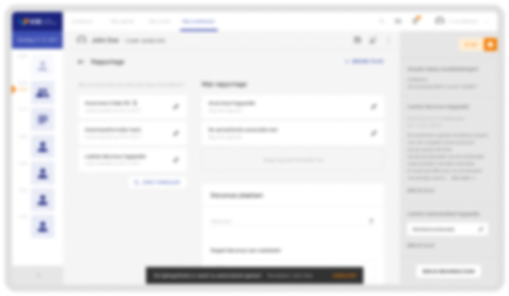
The main question of the client was focused on the fact it should be context-driven. This part was in my opinion still missing. Therefore I got in another ideation loop. I designed the next follow-up mid-fidelity prototype, did a heuristic evaluation with another UX designer and tested the second prototype again with six participants representing the target group.
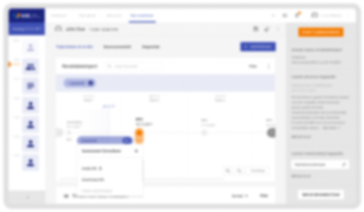
During the previous tests I learned that healthcare providers have a need to read information as well as write down information, especially when thinking in terms of recognition rather than recall. This was at that moment not possible in any EHR.
“If you can realize something like this I will finally have time to go lunch again”
Last iteration
With the previous results in mind I started ideating again. This time I focused on the need to read information as well as add information at the same time. I came up with a solution based on a split screen functionality. After sketching again I started to design a new prototype in Sketch. I've tested this prototype again *surprise* with the target group.
Based on the testresults I made an advisory (test) report as well as a design report. I presented the outcome and the need of further research based on my research.
Next case