VerzekerdVia
The research to how to be assured of insurance
Commissioned by a&m impact in 2016
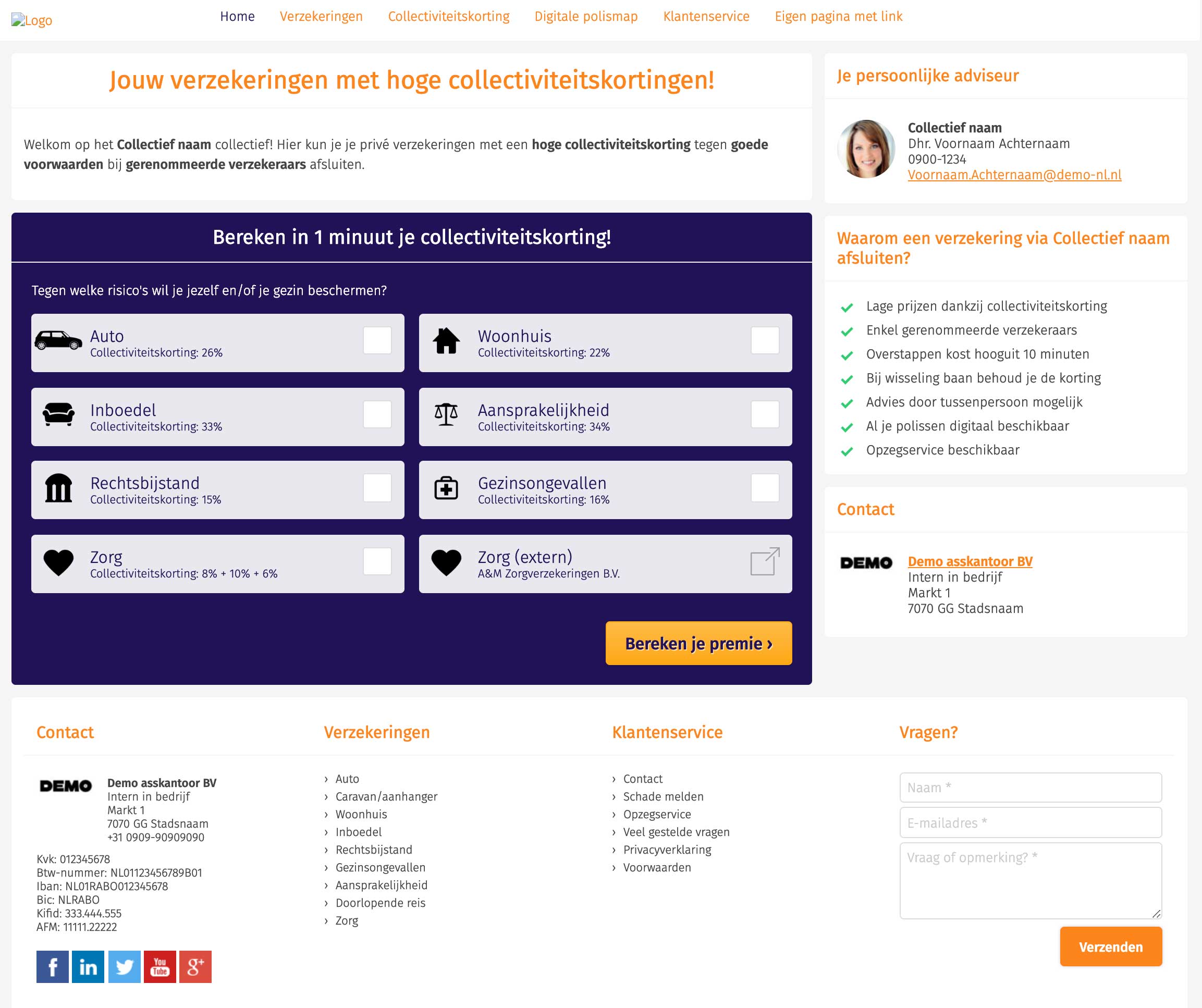
VerzekerdVia is an online collective insurance platform for the aim of being user-friendly, accessible and maximally converting, whereby different types of collective private insurances can be offered to employers.
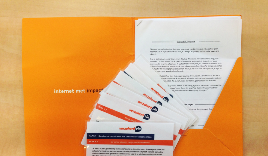
This study investigated how user-friendly the already existing collective website of VerzekerdVia was. For this I conducted a usability test with seven test persons between 25 and 55 years old. Using task scenarios, these people had to go through the process of requesting an insurance via VerzekerdVia.
This project and its test report is used as example and learning material in the courses of Communication and Multimedia Design at the Hogeschool van Arnhem en Nijmegen in 2017.
Process
Usability testing is the most common technique to check how usable your interface is. The power of this qualitative technique is that it focus on what users do and not what they say they do. For this project (due to time reasons) I conducted the test only once, but bare in mind that it’s not one time blessing. A good usability test is iterative. You need to repeat the process until the design is not confusing anymore and your users are able to achieve the scenarios according to their mental modals.
For this test I first created a test plan, identified objectives, carefully wrote down task scenarios and recruited participants. While facilitating the test I observed the participants to identify issues and possible solutions. I asked them open questions as well as let them fill in a (online) form afterwards to specify their level of agreement or disagreement on a symmetric agree-disagree scale for a series of statements. I analysed the data together with the qualitative insights. The last step was to create a test report in where I (visually) identified the issues and described design recommendations supported by old versus recommended visual designs.
-
Results
There was mainly reduced user-friendliness due to inconsistency. Besides, instead of being shown a top three policy users were obliged to continue with the only policy that was presented to them at that time. This policy did not have to be selected by the user either. This resulted in users becoming suspicious and starting to doubt. They did not understand what the intention was, why it suddenly looked different and what the result would be.
Users also indicated that they would like to be able to compare the insurance policies on the basis of policy conditions and therefore not only on the basis of price differences. In addition, they wanted to be able to view all other insurance policies in comparison, rather than just the top three. Some indicated that they might be able to find a more suitable insurance policy had the system known more about their individual needs.
The test clearly showed that there was a target group that wanted to find out everything in detail and that there was another target group that was happy the system did everything for them.
Advice
To solve aforementioned problems, more consistency had to be applied and the procedure of the insurer had to be more clearly explained on the website. Therefore, I provided possible solutions with visual redesigns within the test report, categorized by urgency.
And of course… I presented the outcome internally (with pizza!).
Next case